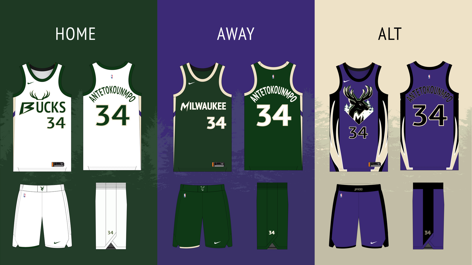
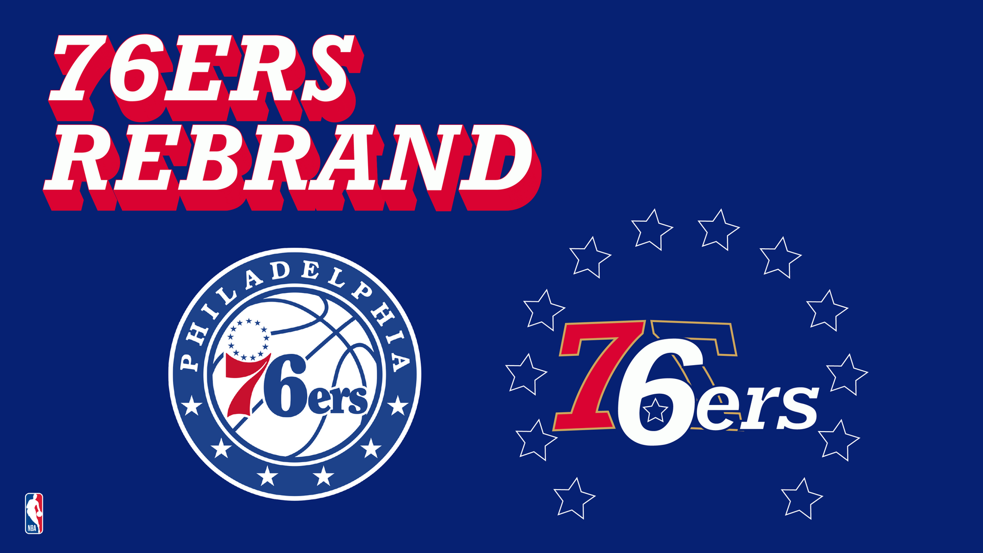
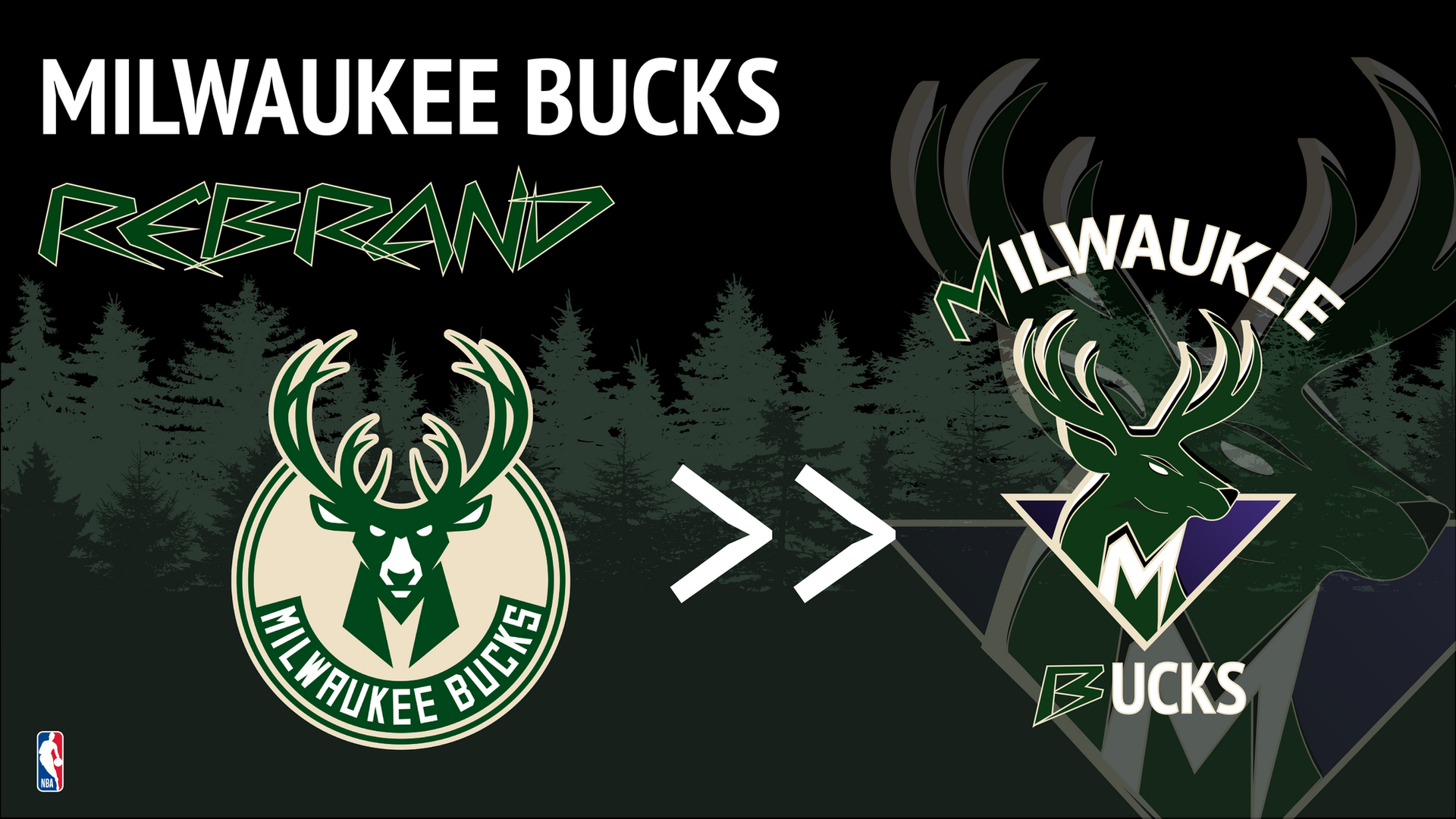
Brand / Identity / Sport

NBA Team
Rebrands

A personal exploration reimagining NBA team identities, pushing logos, color systems, and uniforms into new visual territory while honoring each franchise's roots.

Scroll

As a lifelong NBA fan, I wanted to explore what it would look like to rethink team identity from the ground up, logos, color systems, uniforms, without losing the heritage that makes each franchise feel like home.

Project

NBA Team Rebrands

Role

Designer & Art Director

Scope

Identity / Color / Uniform

Tools

Illustrator / Photoshop

Chapter 01

Logo Systems

01
NBA Logo Overview

01, Primary Marks

Marks that feel
earned, not new.

Every NBA franchise comes with decades of identity debt, fans who wore the original colors, eras that defined the brand, mascots that became shorthand for the city. The goal wasn't to erase that, it was to refine it.

I explored primary wordmarks, secondary icons, and monogram systems, each designed to scale from jumbotron to jersey patch without losing personality.

01
Heritage Audit Studied each team's logo history to identify enduring visual DNA.
02
Symbol Exploration Iterated through primary marks, secondary icons, and wordmark lockups.
03
Scale Testing Pressure-tested marks from jumbotron down to 16px nav icons.
NBA Logo Rebrand Detail

Chapter 02

Color & Identity

02
Color Identity

02, Palette Systems

Color carries
more than you think.

Team colors aren't just aesthetic, they're emotional shorthand. Fans wear them, cities identify with them, and rivalries are built on them. Every palette I developed balanced the primary pair with flexible secondaries for merchandise, broadcast, and digital contexts.

The result: tight, disciplined color systems that feel bold on jumbotrons but considered in print and product.

Chapter 03

Jerseys

03
Jersey Design

03, Uniform Design

The logo's
biggest canvas.

A jersey is the single most visible application of any team's identity, it lives on TV screens, in arenas, and on the backs of fans in every city the team visits. Jersey design became the ultimate test of whether each rebrand held up at scale.

I explored home, away, and city-edition variations, each balancing readability from the nosebleeds with the craft details you only notice up close.

Jersey Full
Jersey Detail

Takeaway

Great sports branding doesn't chase trends, it finds the thread between heritage and fresh, and pulls hard. Fans should feel the future without losing the past.

← Previous Samsung Visual Design Next Project → DPRR Campaign