Branding / Packaging / Web

HEKKO
Coffee

A coffee brand I created from the ground up: a striped, high-contrast identity designed to be unmistakable on a bag, a cup, and a storefront, plus the website that brings it together.

Scroll

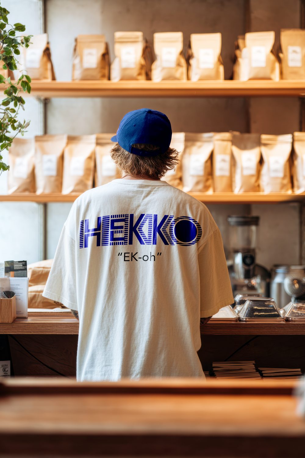
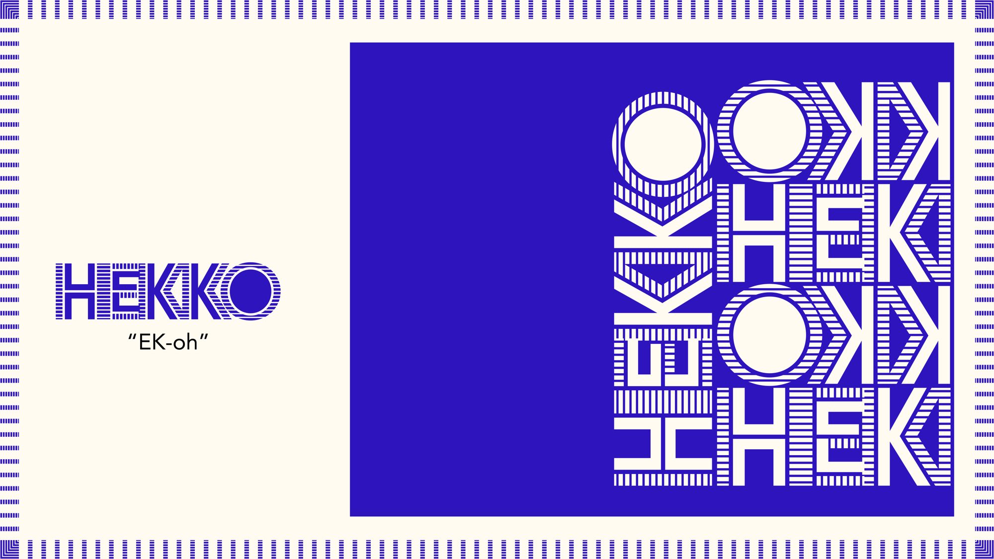
HEKKO (“EK-oh”) is built on pattern. Every letter is cut with stripes, the palette is one bold blue on cream, and the mark is a single circle. I wanted an identity that feels loud, playful, and instantly recognizable from across the street.

Project

HEKKO Coffee

Role

Brand & Visual Designer

Scope

Identity / Packaging / Web

Tools

Illustrator / HTML + CSS

Chapter 01

Early
Concepts

01
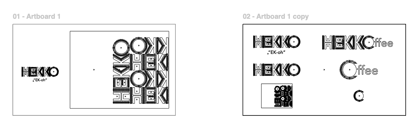
HEKKO wordmark, lockups and pattern shown in Illustrator outline view

01, Outline View

Letters before
color.

The earliest drafts lived as pure paths. In outline view you can see every stripe, anchor point, and curve behind the wordmark, the lockups, and the pattern.

01
WordmarkHEKKO with its “EK-oh” pronunciation, built from striped letterforms.
02
LockupsHEKKOffee, Coffee, and the round mark explored on one board.
03
PatternThe wordmark stacked and mirrored into a repeating tile.
04
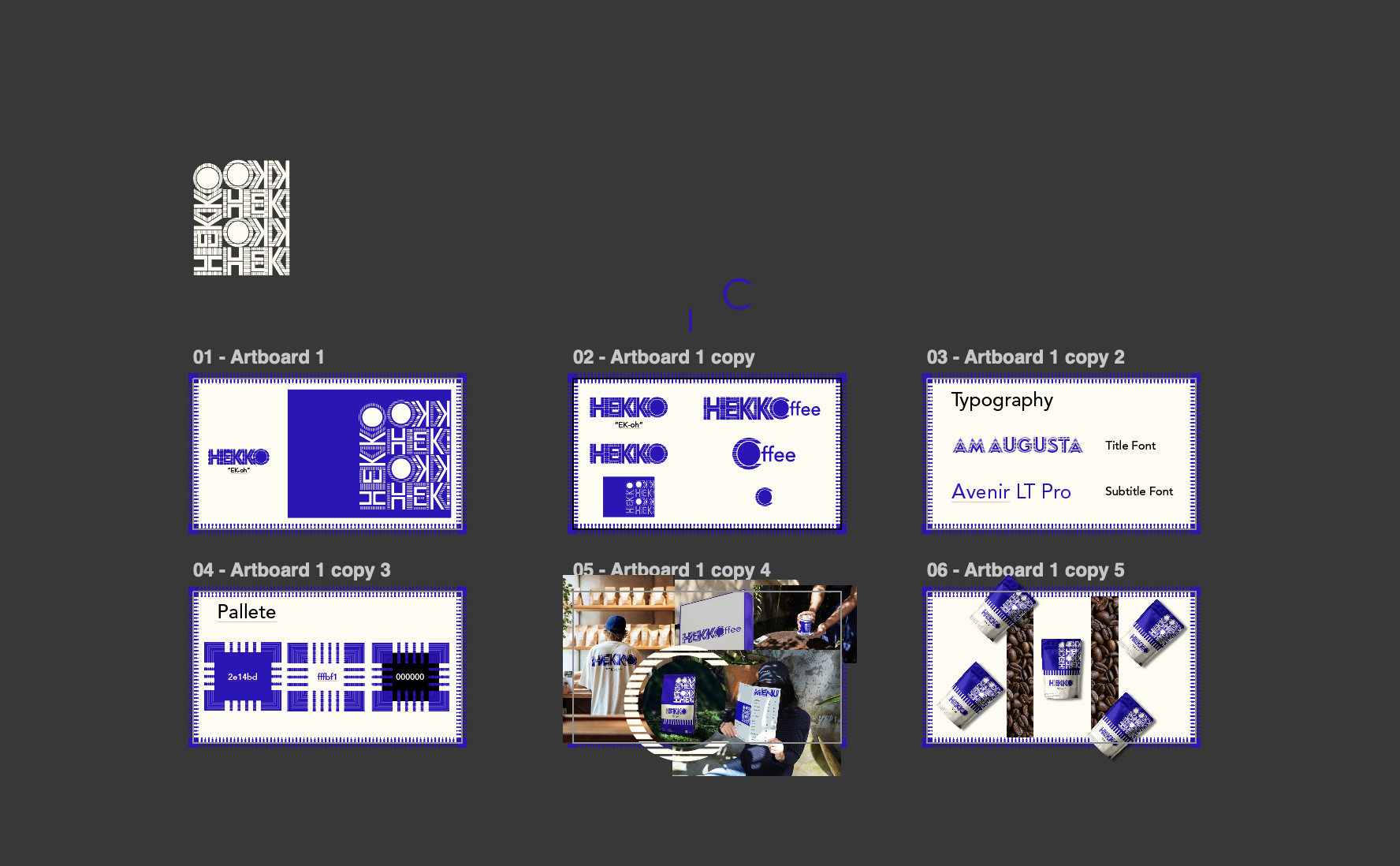
Full Kit BoardLogos, type, palette, and applications laid out side by side.
Illustrator workspace showing the six HEKKO brand kit artboards

Chapter 02

The Brand
Kit

02
HEKKO wordmark next to the stacked, mirrored pattern on blue

01, The Name

Say it:
EK-oh.

The name is short, easy to say, and easy to remember. The wordmark carries the personality: heavy letters filled with horizontal and vertical stripes.

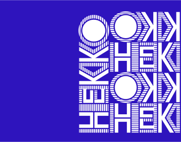
The same letters, stacked and mirrored, become a pattern that works as a graphic on its own.
HEKKO logo sheet with wordmark, HEKKOffee lockup, Coffee mark and pattern tile

02, The System

One identity,
many pieces.

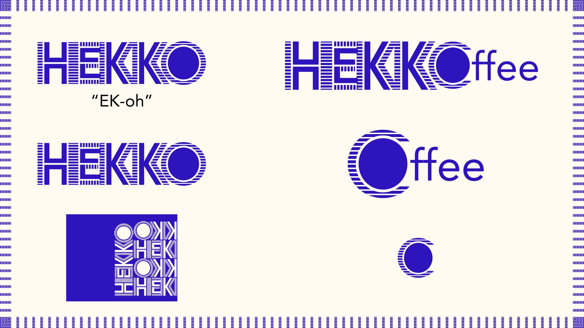
A small set of parts that all work together, so the brand can show up on anything without losing its voice.

01
Logo FamilyHEKKO wordmark, HEKKOffee lockup, Coffee lockup, and the round mark.
02
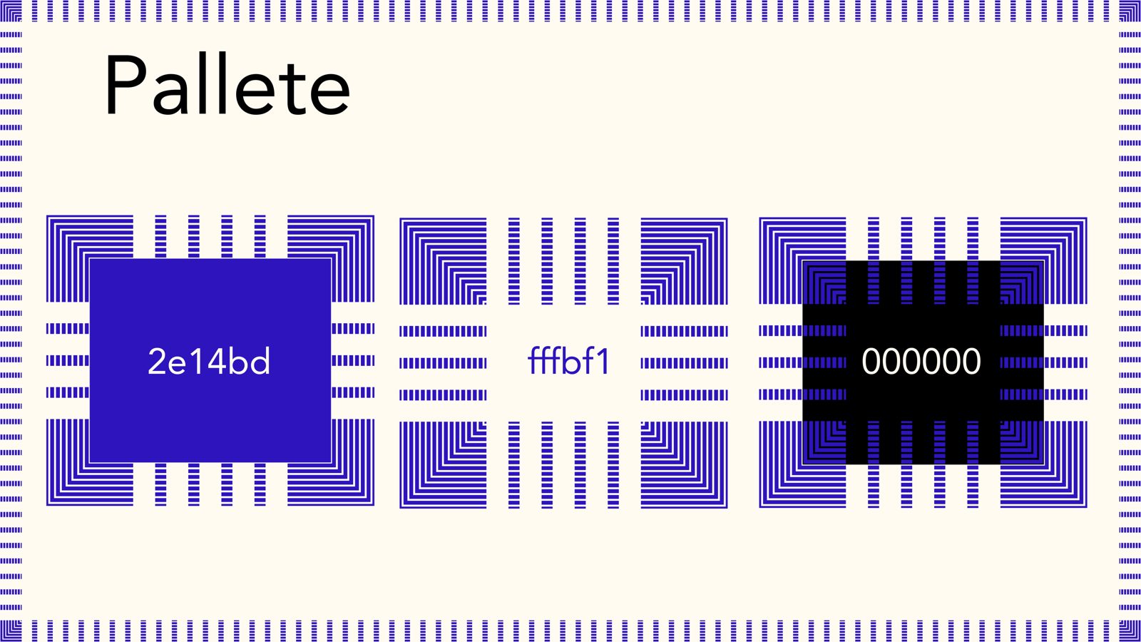
PaletteBlue #2e14bd, cream #fffbf1, and black #000000.
03
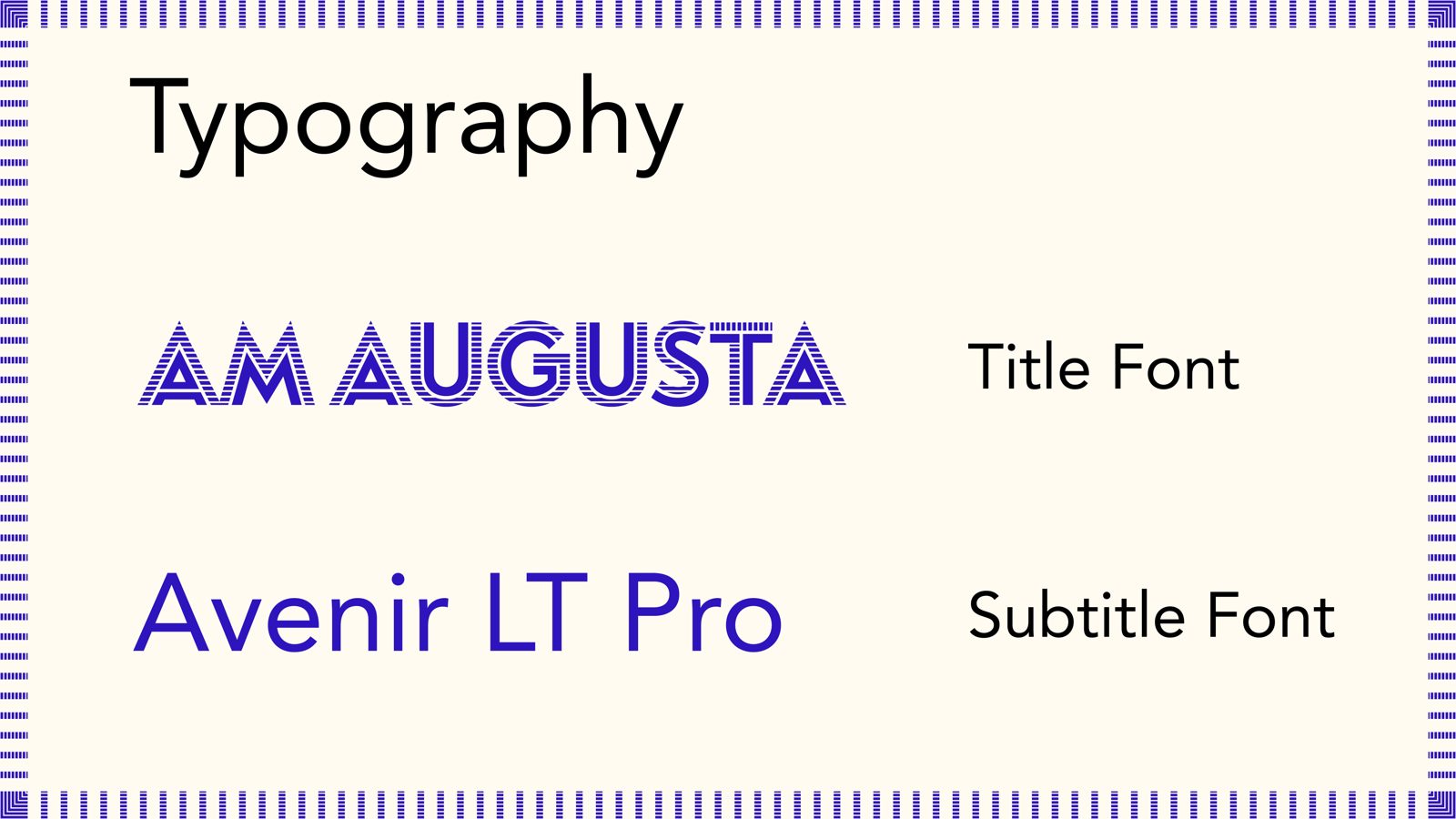
TypographyAM Augusta for titles and Avenir LT Pro for subtitles.
04
PatternThe wordmark stacked and mirrored into a repeating tile.

Chapter 03

In the
World

03
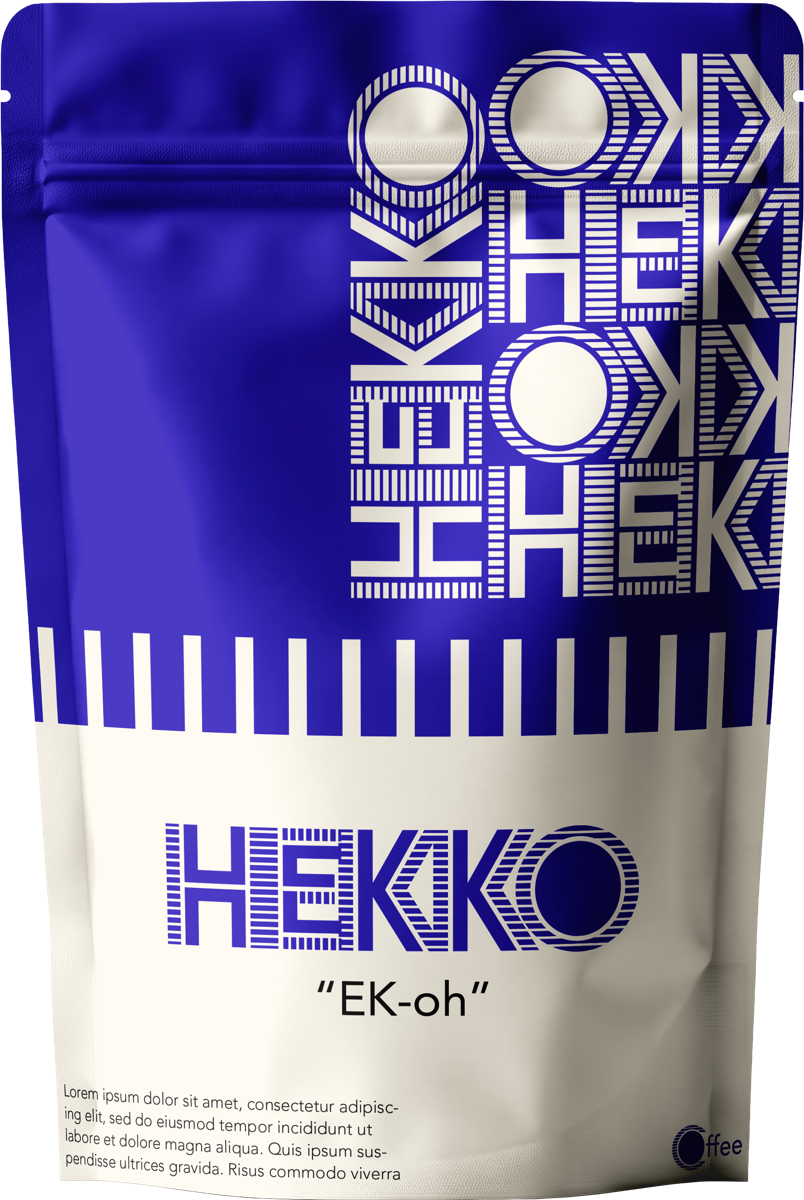
HEKKO coffee pouch

03, Applications

Loud on the shelf,
clear up close.

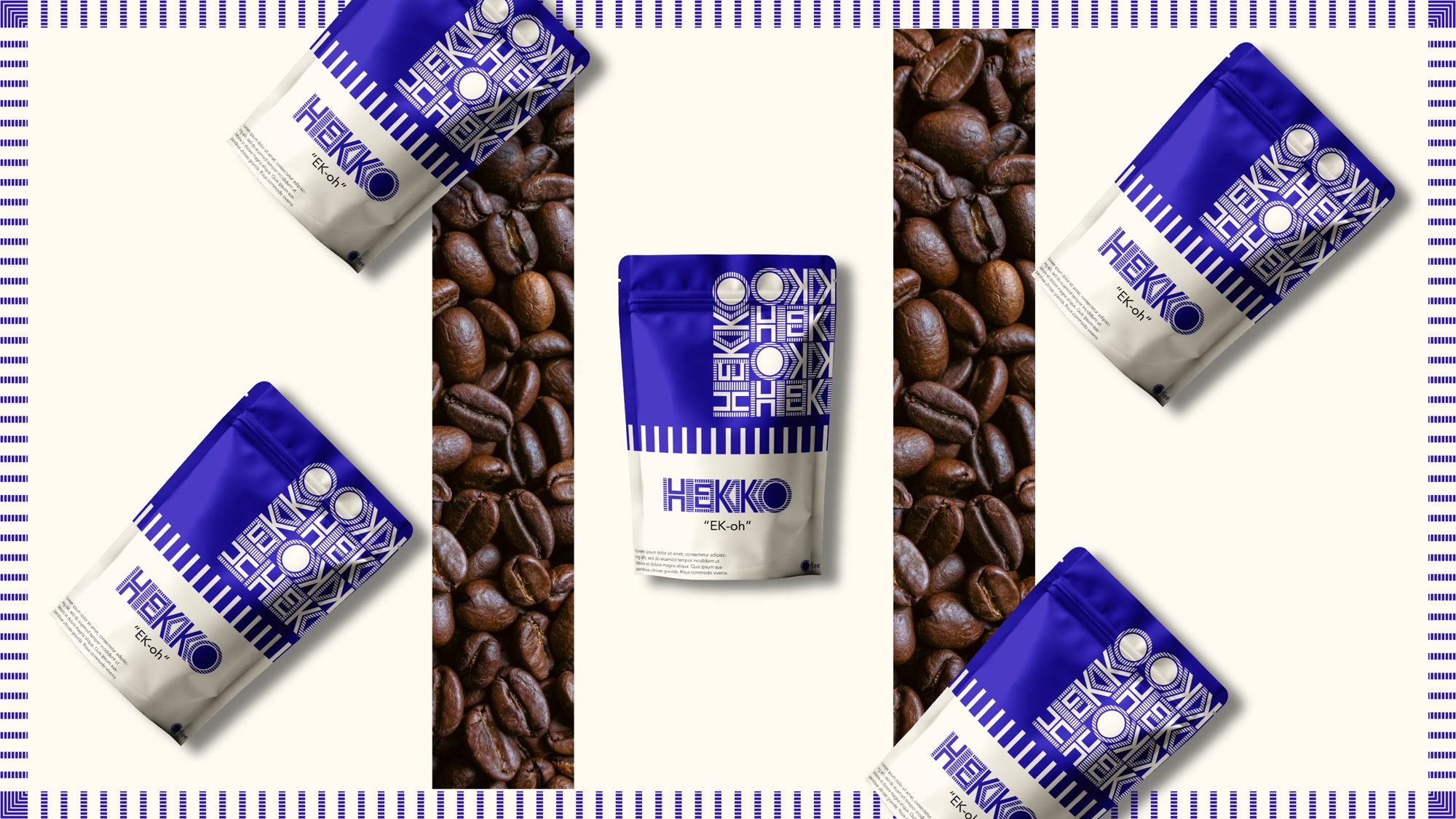
The pattern wraps the top of the pouch while the wordmark sits quietly on the cream label. Big graphic, simple information.

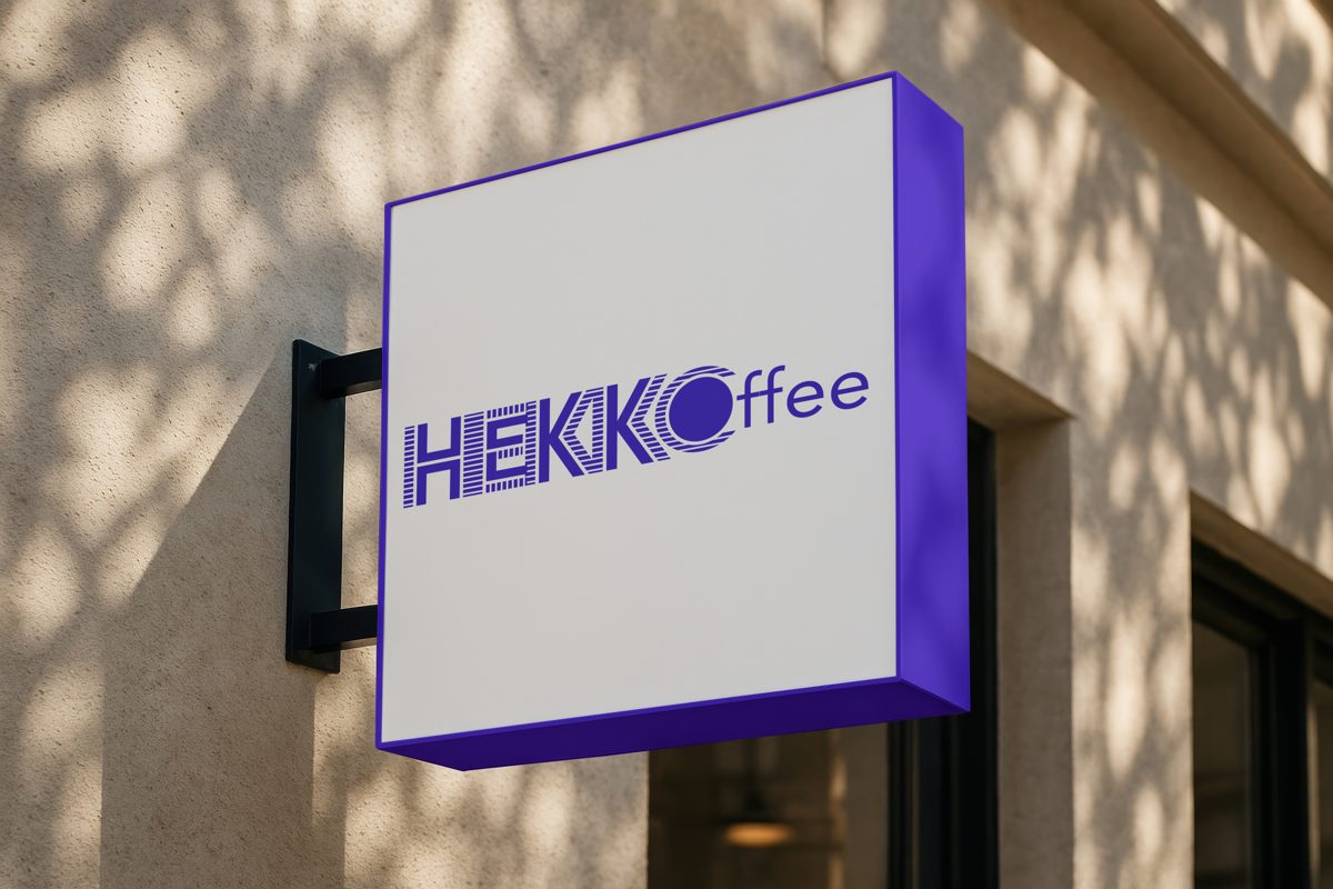
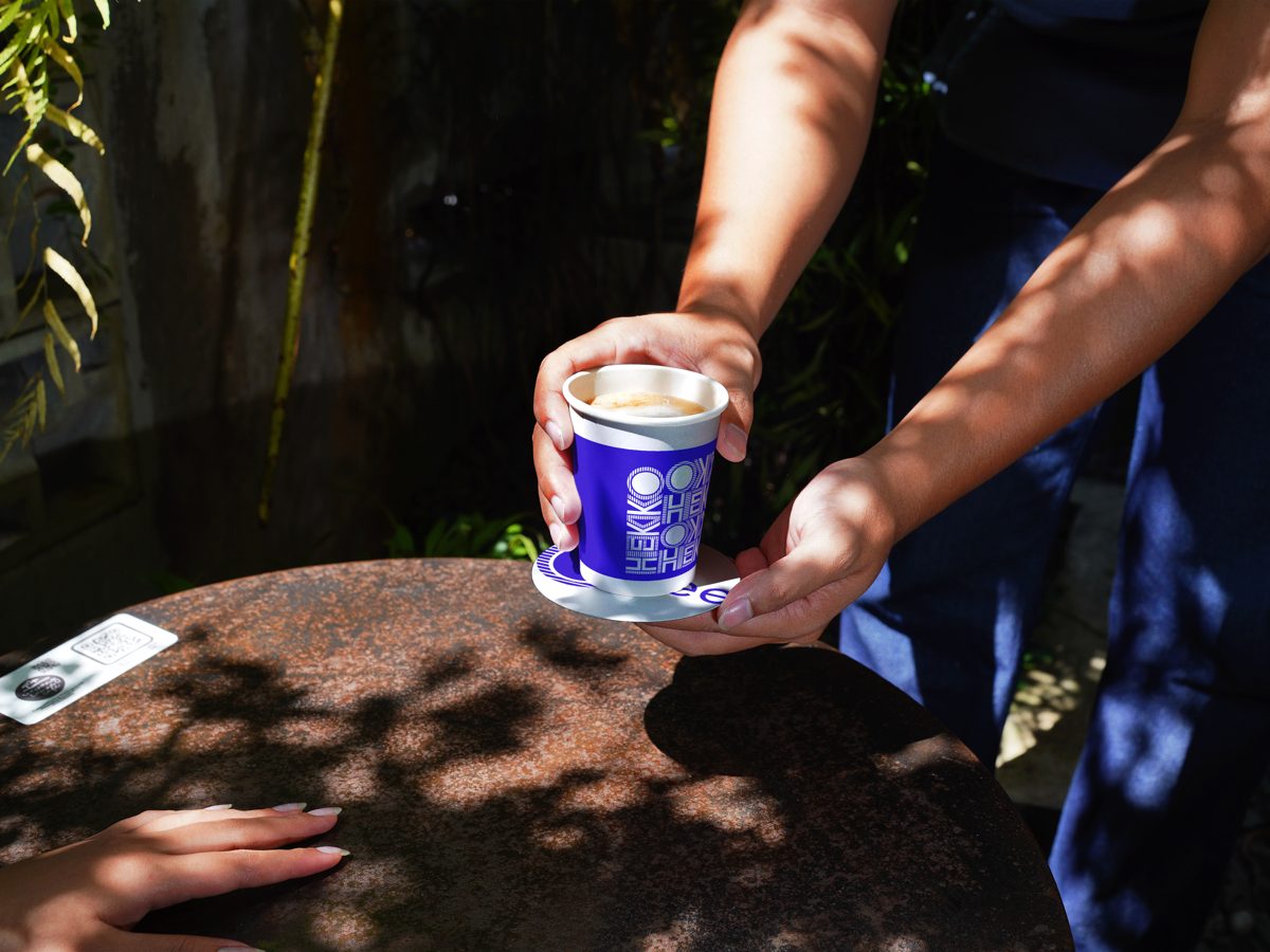
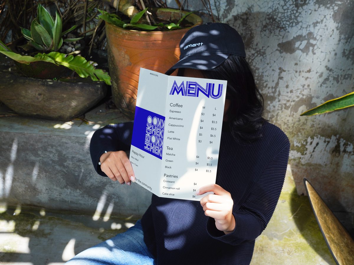
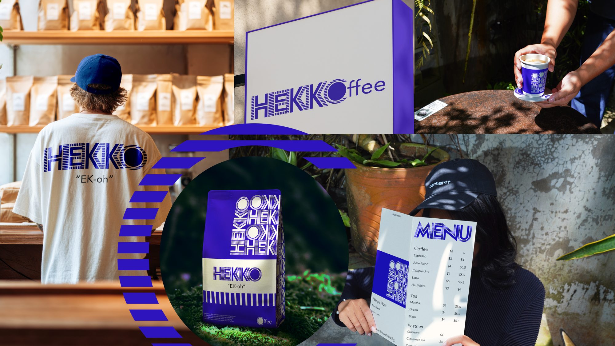
From there the system extends to cups, signage, menus, and merch.

Collage of HEKKO applications: sign, cup, shirt, bag, and menu
HEKKO pouches arranged around roasted coffee beans

Takeaway

A strong identity is a system, not a single logo: a pattern you can spot from across the street, a mark that holds up small, and a palette that never needs explaining.

Chapter 04

The Live
Site

04

See it live.

The brand kit, built out as a working coffee website: menu, shop, and story.

View the live website
← PreviousPS5 Dashboard Next Project →Samsung Visual Design