UX / Product / Gaming

PS5
Dashboard

A concept redesign of the PlayStation 5 home experience, rethinking how players browse, launch, and discover content across the console's signature interface.

Scroll

PS5's dashboard is a beautifully cinematic interface, but under the surface, small friction points add up. I explored how the home experience could become faster, clearer, and more expressive without losing what makes it feel distinctly PlayStation.

Project

PS5 Dashboard Concept

Role

UX / UI Designer

Scope

Research / Wireframes / Prototype

Tools

Figma

Chapter 01

The Problem

01
PS5 Home Screen

01, The Brief

Cinematic feel,
quieter friction.

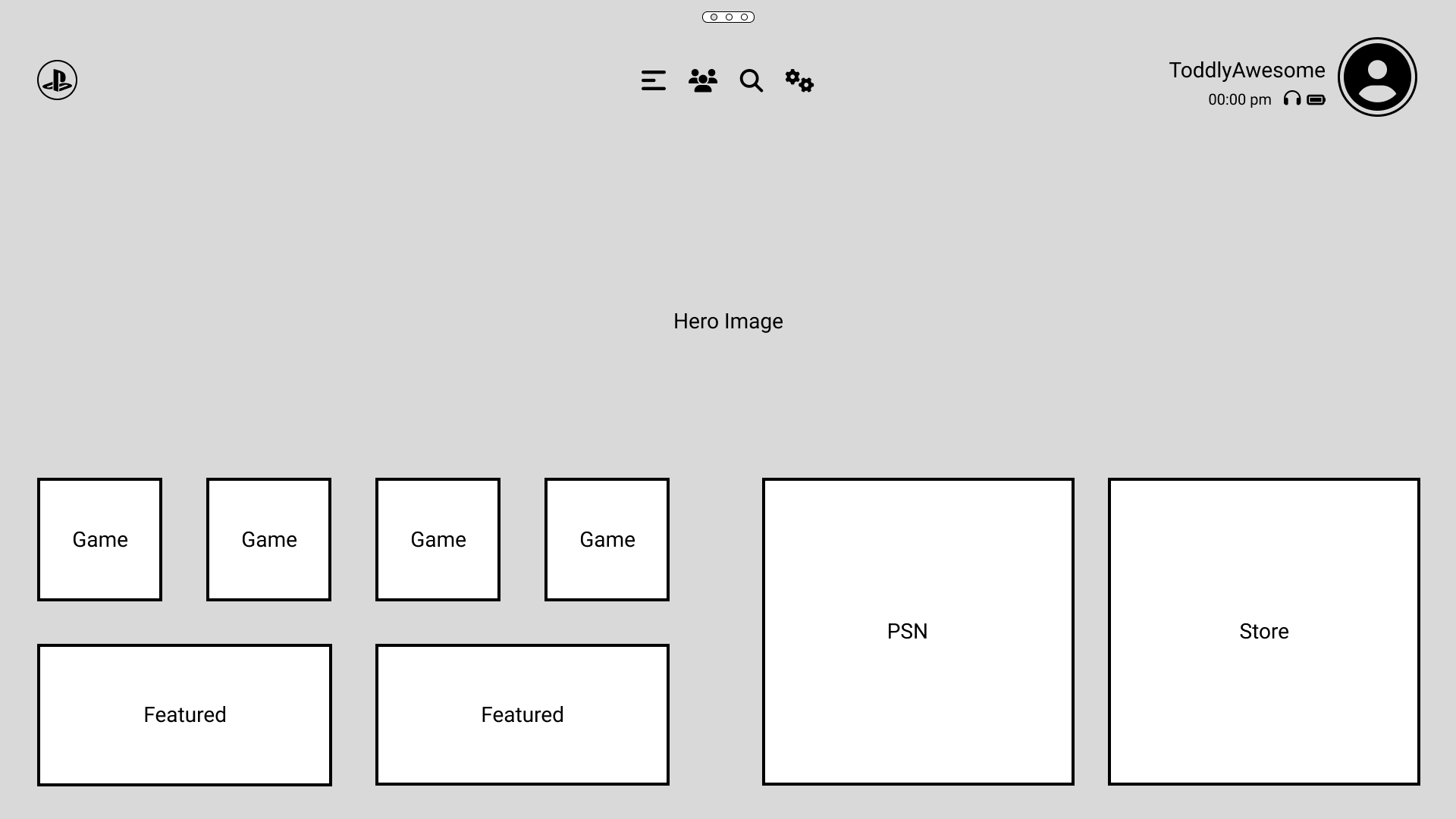
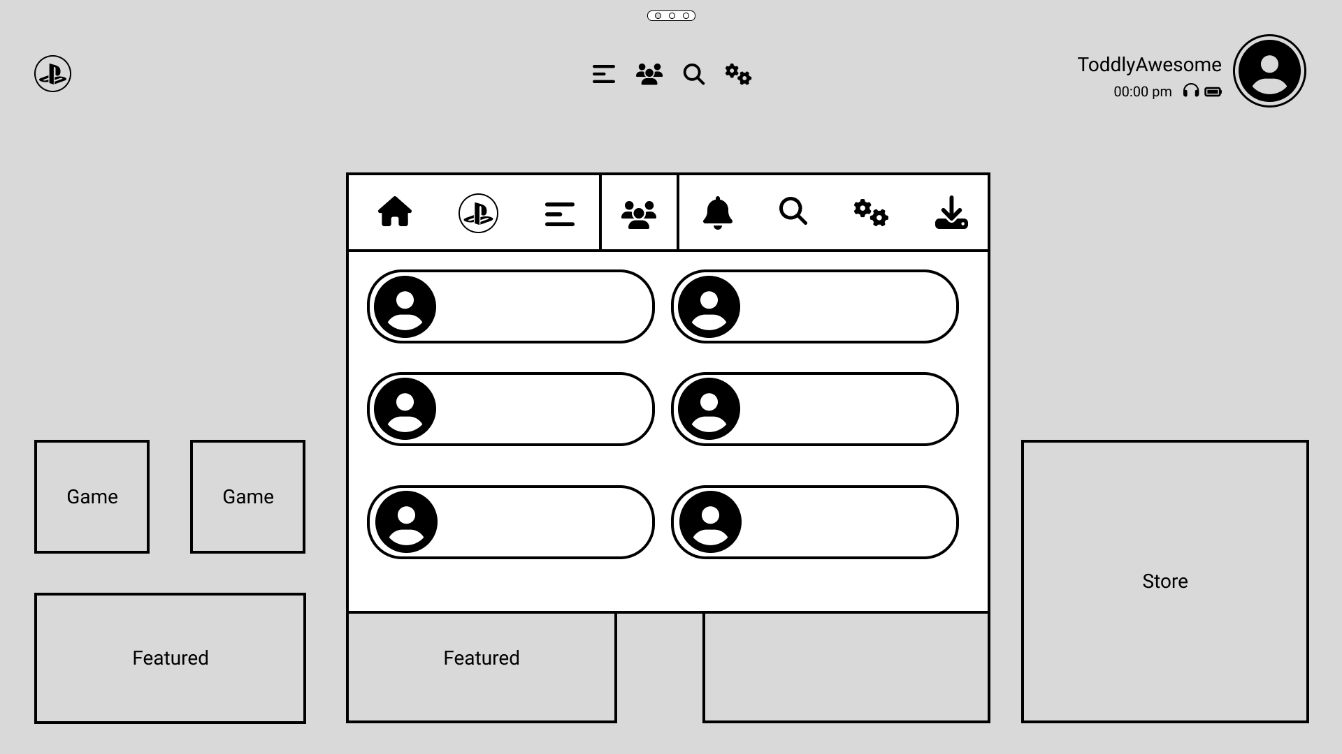
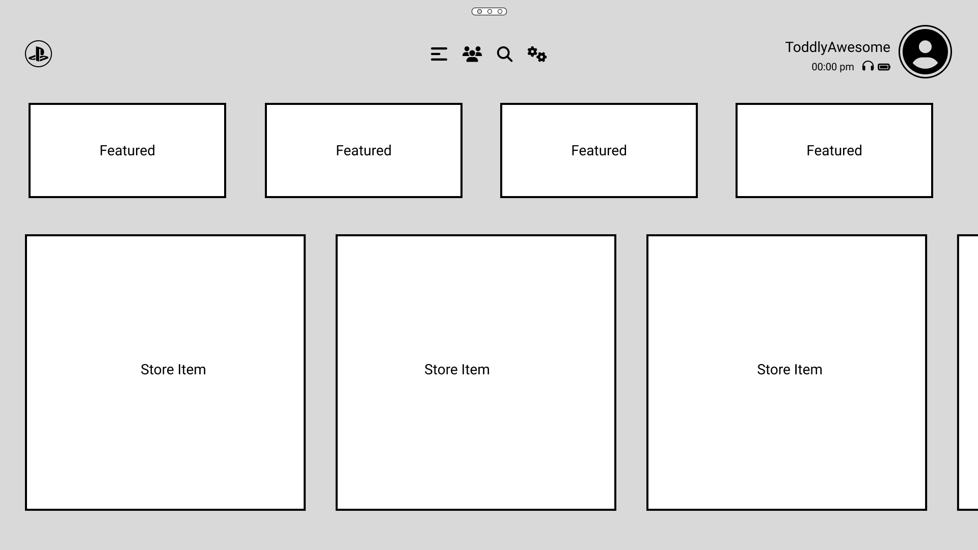
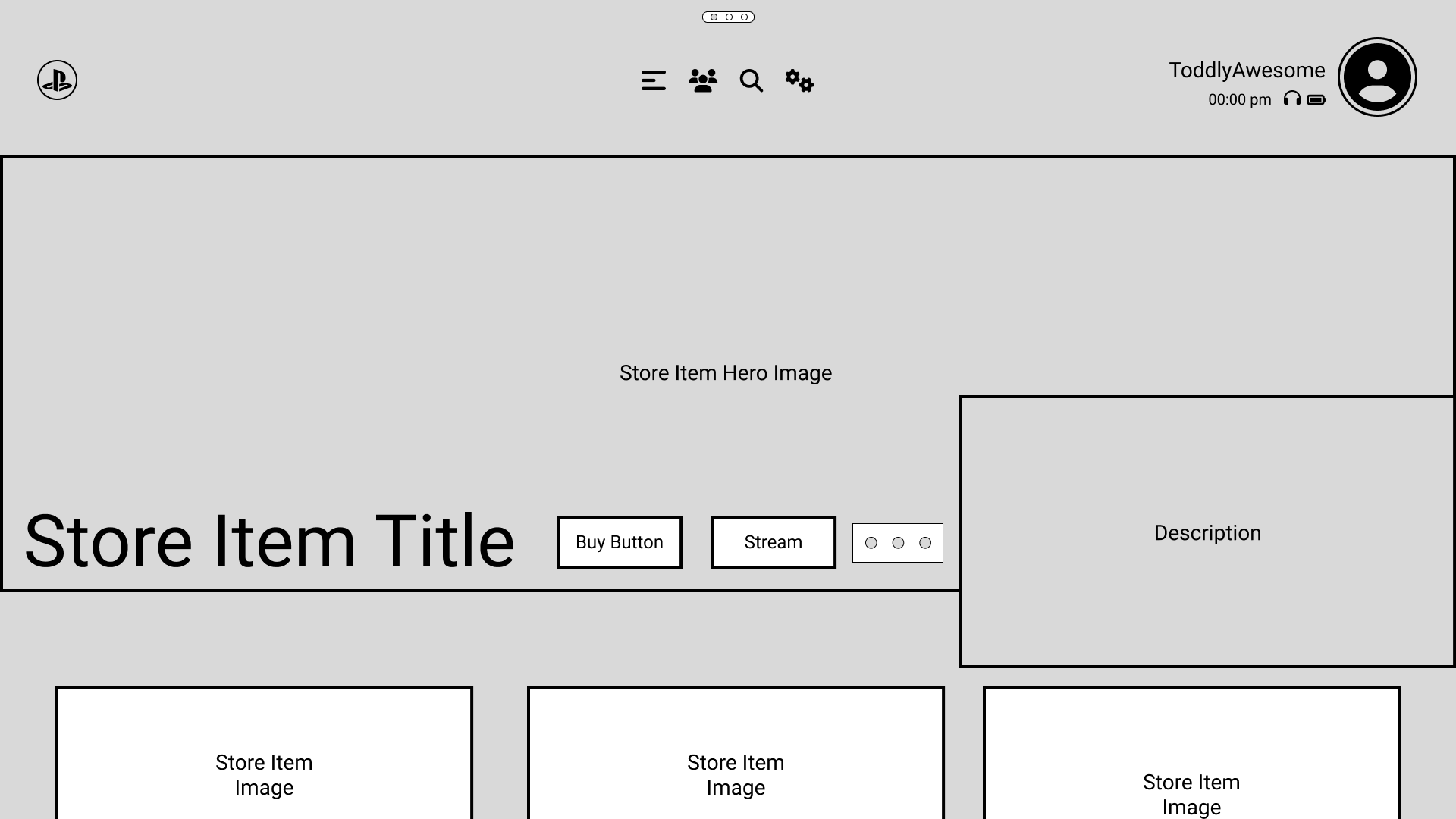
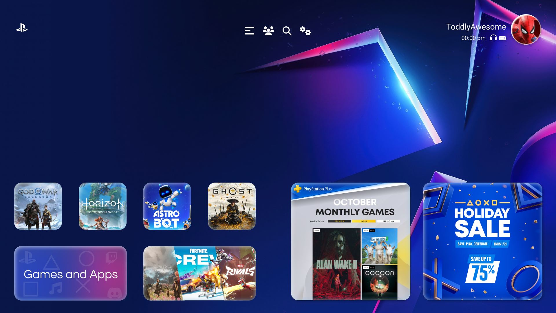
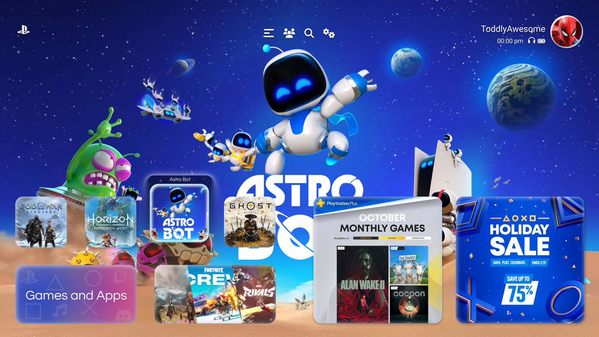
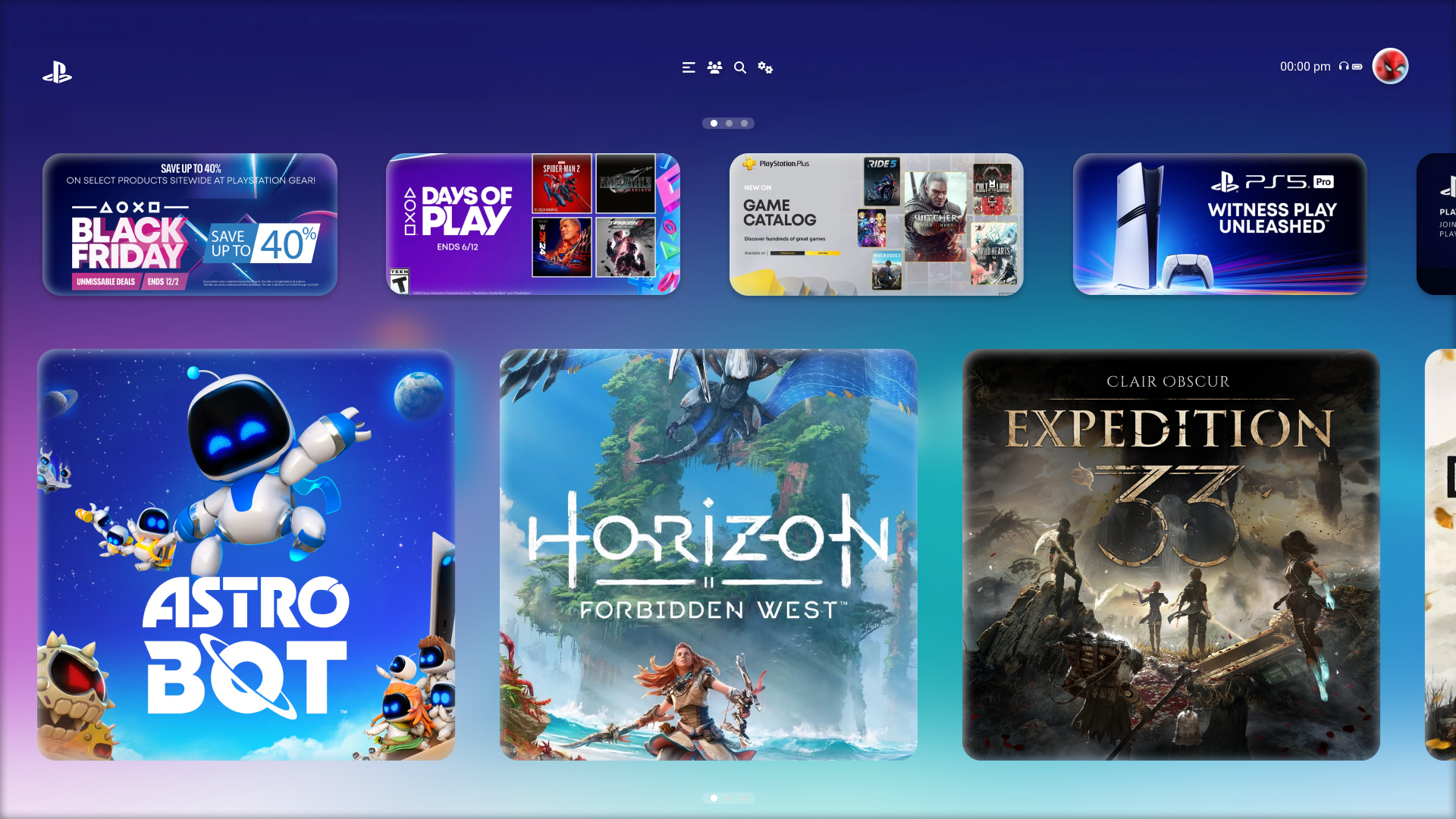
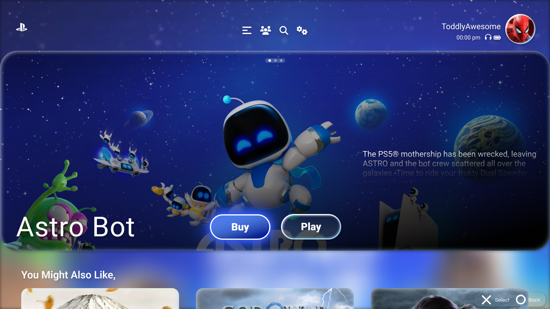
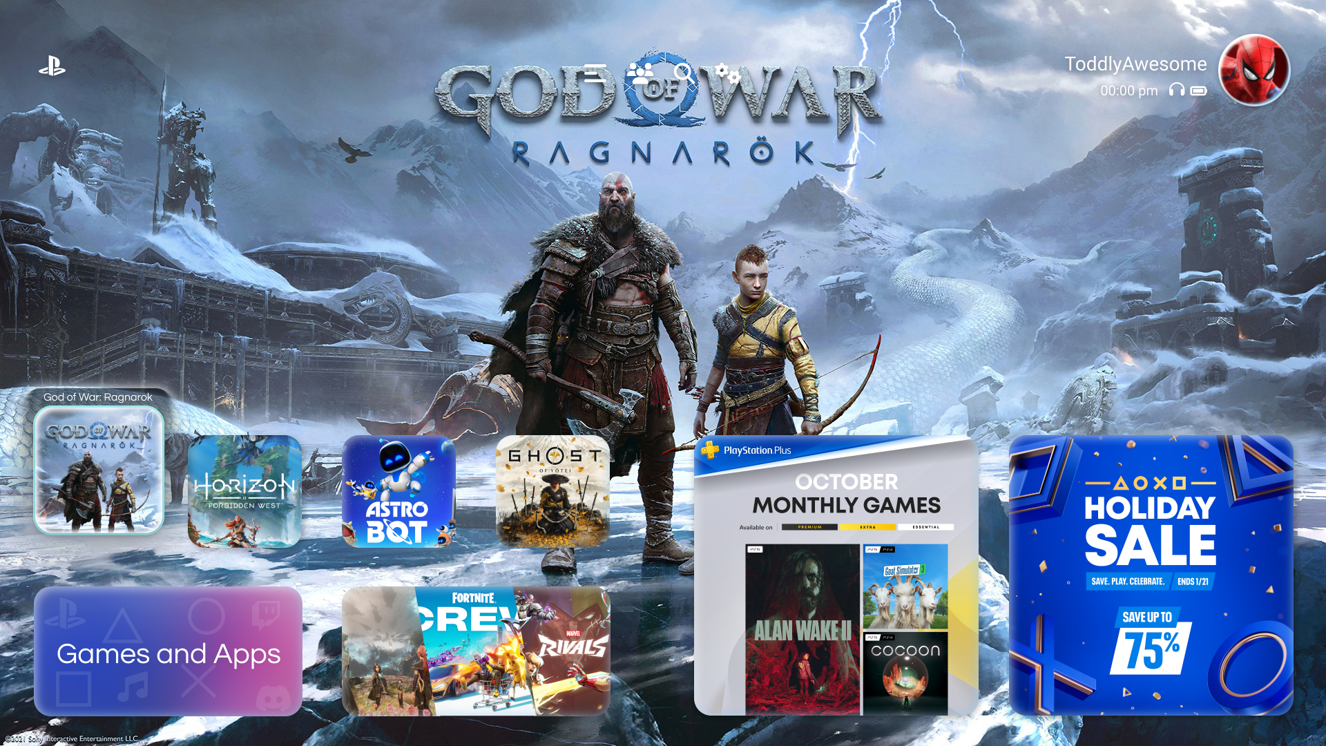
The PS5 dashboard is gorgeous, large cinematic tiles, rich motion, immersive audio. But everyday tasks like reopening a specific game or navigating to the store often require more clicks and mental load than they should.

I set out to preserve what players love about the PS5's personality while tightening the interactions around the most common flows.

Chapter 02

Research &
Wireframes

02
Home Wireframe

02, Structure First

Low-fi before
high-fidelity.

Before touching visual design, I mapped the core flows in low-fidelity wireframes. This let me test hierarchy and navigation patterns quickly without getting distracted by polish.

01
Flow Audit Mapped the existing PS5 flows for home, game launch, store, and settings.
02
Wireframe Sketching Paper and Figma sketches to explore new hierarchies and surface patterns.
03
Iteration Refined wireframes against self-critique and core usability heuristics.
04
Hand-off to Visual Locked structure before moving into color, type, and motion decisions.

Chapter 03

Visual Design

03
PS5 Home Prototype

03, High-Fidelity

Signature PS5 energy,
tightened flows.

With the structure locked, I moved into visual design, bringing the PS5's hallmark deep blues, translucent panels, and cinematic tile motion into every screen.

The goal was a dashboard that still feels unmistakably PlayStation, but gets players into their games faster and makes the store's depth easier to browse.

Store Prototype
Store Selected Item

Chapter 04

Interactive
Prototype

04

Live Prototype

Click through the full flow.

Takeaway

The best console dashboards feel invisible at speed and immersive at rest, cinematic when you want to browse, out of the way when you just want to play.

← Previous Xbox Dashboard Next Project → Samsung Visual Design