UX / Product / Gaming

Xbox
Dashboard

Reimagining the Xbox console's home experience, a case study in designing for speed, discoverability, and the split-second moments when players pick up the controller.

Scroll

Gaming dashboards sit at a unique intersection: they need to be fast enough to disappear, but rich enough to feel like home. I explored how Xbox's dashboard could better balance speed, personalization, and content discovery.

Project

Xbox Dashboard Redesign

Role

UX Designer

Scope

Research / UX / UI

Tools

Figma / After Effects

Chapter 01

The Challenge

01
Xbox Research

01, The Problem

A dashboard players
bounced off, not into.

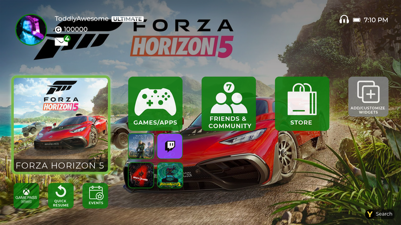
Xbox's dashboard packs an enormous amount of functionality, library, store, friends, party chat, streaming, achievements, but users reported it felt cluttered and slow. Core tasks like "jump back into the game I was just playing" took too many clicks.

The goal was to identify friction points in the current experience and propose a cleaner, faster hierarchy, one that respects how people actually use a console in the first 10 seconds after turning it on.

Chapter 02

Research & Discovery

02
Xbox Research Spread

02, Understanding Players

What do players
actually want first?

I mapped player journeys across different session types: short play sessions, couch co-op, streaming movies, and catching up with friends. Each had different "first click" priorities that the current dashboard didn't surface well.

01
Competitive Audit Compared Xbox, PS5, Switch, and streaming platform home experiences to identify patterns.
02
User Interviews Talked to players across skill levels about their first 30 seconds on the console.
03
Journey Mapping Charted common tasks to identify where the current UI created friction.
04
Insight Synthesis Distilled research into design principles that guided every decision that followed.

Chapter 03

Design &
Iteration

03
Xbox Execution

03, Design Decisions

Fewer tiles.
More intent.

The redesign prioritizes a single "resume" action above everything else, because research showed this is what most players want within seconds of logging in. Secondary actions (library, store, social) scale down to smaller tiles that don't compete for primary attention.

Motion was used sparingly and with intent: subtle parallax on hover, quick transitions between panels, and animated accents on the green Xbox brand moments that give the system its identity.

Xbox Motion

Takeaway

Great dashboard design isn't about fitting everything on screen, it's about getting out of the player's way so they can do what they came to do: play.

← Previous NASA HCOP Next Project → PS5 Dashboard